BAGD103

Visual Metaphors

The workshop for today was to create a visual metaphor. A metaphor is a figure of speech that consists of substituting/replacing objects by other objects with those which have common features.

For example, rainforest trees are the lungs of the earth (implying that Earth could not survive without trees like we could not survive without lungs). The [domain] source is the body, the [domain] target is the environment.

wwf_lungs

Image taken from: https://tjmorano.wordpress.com/2013/02/05/graphic-lungs/

For the task we were asked to create an A4 poster either printed digitally or paper-based, creating a pictorial metaphor.

As we are currently working on these records covers I thought perhaps it would be an idea to look at one of the songs and the one that always seems to stand out in my mind is the Eurhythmics song ‘I saved the world today’.

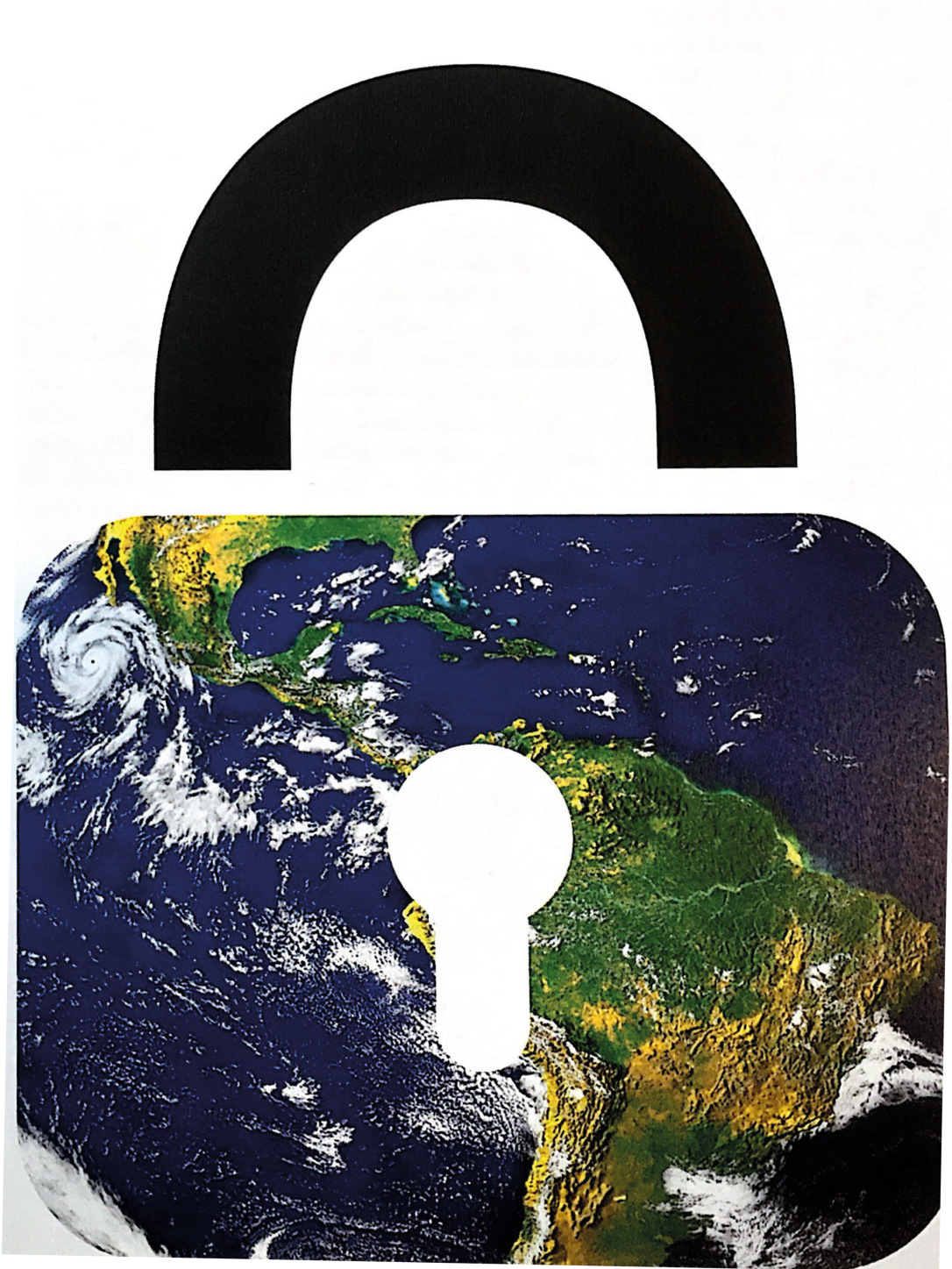
I thought about the song, I listened to it again, and considered what sort of image would indicate safe. I thought about a lead lined case with a combination lock, one of those safes that you see in the movies when you blow them up with dynamite. However, this seemed to be too much of a bulky image to work with. So, then I thought about a piggybank may be savings may be but no that didn’t really appeal either. Then I thought about a lock, a padlock, now that sounded like a reasonable idea. So, I started looking online for free vector images of padlocks and came up with the following.  Then I looked for images of the world. Images that were colourful and bright.  Once I found my two images I took them into Illustrator and merged them together. The following image is the metaphor that I came up with. No words, no explanations, hopefully the person looking at the image would understand that the world is safe within a padlock. What do you think?

new doc 2018-04-21 18.23.02_20180423094525


BAGD103

Creating Type

Today we were asked by our tutor, Matt, to put away our laptops and get our hands messy!.  He provided us with ink, nibbed pens, paper and other mark making equipment.  Firstly we had a tutorial where he showed us some slides providing information on various artists that could be of interest to this topic.  I did some further research into these artists and the results are as follows:

Rob Lowe aka Supermundane.  I had never heard of Rob Lowe (other than the 1980’s Actor of course!) and was very excited about his work. This guy produces amazing work using lots of bright colours and many lines.  I love the abstractness of his artwork and the way it makes me feel happy.  I have practised Zentangle, a form of doodle originating in America, for many years and I can see sections of his work that looks similar.  I will be researching Rob Lowe’s work further.

Screen Shot 2018-04-10 at 20.25.48

Image taken from https://supermundane.com

Jessica Hische is a lettering artist based in California where she shares a studio with fellow lettering artist Erik Marinovich.  She is another artist that I was not aware of until I started my degree course in September 2017.  Wow, why have I never seen her work before.  I LOVE it.  Beautiful creative lettering and incredible logo design.  Again, further investigation and research needed here as well.

Screen Shot 2018-04-10 at 20.53.21

Image taken from http://jessicahische.is

Kate Moross is a designer who doesn’t like to be labelled as any one thing. She designs illustrations, fun typography, shoots videos for musicians and for adverts and runs her own studio, studio morose, in London with three other designers. She burst onto the scene in 2008 with her passion for colour and energetic squiggles catching everyone’s eye, this has made her be one of the most sought-after collaborators in the design world. After watching one of her talks on YouTube I have to say that her passion and excitement about design is catching. She comes across as an honest and genuine person who isn’t afraid of expressing what she believes in.Screen Shot 2018-04-11 at 11.02.10

Image taken from http://www.katemoross.com/handdrawntype

Another designer that we looked at is Julian House. Julian isn’t just a graphic designer he also co-owns a record label, the Ghost Box Music, and is a musician. However he is popularly associated with the design studio known as Intro where he is a partner and creative director. He works across all media that ranges from print to sound and film design. Julian House is renowned for his artwork on record covers and is particularly recognised for his collage work, the images for which are heavily drawn from comic book art and record sleeve design.001_100club


Image taken from https://www.intro-uk.com/work/100-club/

So, after we had looked at all of these wonderful, colourful and expressive designers Matt set us some tasks. He told us “to play with scale and to be expressive. Use the lyrics as a starting point, or an inspired word from your interpretation of the chosen song. Draw inspiration and directly link it to a new unique style of typeface, i.e., sweet packaging”

Task 1: Begin by drawing a large grid, each square will contain a letterform, you may want to just try a baseline and send a line to generate consistency if your style is more raw.

fullsizeoutput_3e


This was great fun. To be honest it was nice to be able to put away the computer for a day and play with ink and paper. I think I forgot to stay within a grid and just let my hand play across the paper using a flat wooden implement to create some letters. I think perhaps I need to remember that there is usually a brief to work to and it’s important to stick to it. Having said that I was pleased with how some of my letters turned out as you can see from the above photograph.

Task 2: The challenge will be to fit the text into the shapes provided: square, circle, triangle and others you want to develop.

IMG_1019

Again I forgot the brief. It’s all very well letting my creative juices flow but sometimes I really need to remember to work to guidelines. the results of this section of the task is shown above, with a selection of everyones work.

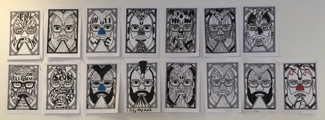
Task 3 to extend this process putting it in application, you may want to integrate your new type to sit around an image already developed, this can be a new image or one of your previous collages. Or please use the supermundane image.

fullsizeoutput_3a

I chose to use the supermundane image as I think most of the class did actually. It was good fun to try and fit words into this interesting image of a face. The photograph above shows not only my effort but the rest of my class’s as well.

I really enjoyed this session and will definitely be using some of these ideas for my record covers and poster designs.


BAGD103

Photo Composition

Today’s workshop looked at how to use photo composition of still life to express/reflect feelings. Prior to this workshop we were asked to bring into uni five items that mean something to us. We weren’t given any indication as to what we would be using these five items for just asked to bring them in. When we got into the workshop we were given eight words, they were as follows:

  1. Anger
  2. Fear
  3. Sadness
  4. Happiness
  5. Perplexity
  6. Terra
  7. Nostalgia
  8. Sophisticated

We were given a brief informing us that the printed images should not be retouched in Photoshop except for colour correction. We had access to lighting and were able to take the photographs wherever we wished.

Photography is not really my forte and can’t say that it particularly excited me that morning. However, I came to university to try new things so I did. I had my favourite CD, my eternity ring, my rescue remedy, my favourite pencil and some nose studs. An interesting combination I think you’ll agree. Had I known what we were doing perhaps I would have chosen some different items but maybe that was the whole idea to just create a still life out of everyday objects. I paired up with one of my classmates and together we produced some photographs.

I think the idea of this exercise was to show us that just using everyday objects and different types of lighting, photographic techniques, and composition can produce an image which needs no words to describe what it means.

On reflection I think perhaps I need a lot more work on doing this kind of thing. I tried really hard to produce something for each of the feelings requested-not sure I quite managed it correctly, what do you think?

BAIS300

BAIS300 – Interdisciplinary Part 1

Screen Shot 2018-04-21 at 18.09.32Tuesday 22nd January 2018

Today we met up with the other students from all disciplines across year 1 at PCA.  We took some time to get to know each other and find out which course we were all doing before we were asked to form groups ensuring that we did not have more than one person from any one discipline.  We formulated a group with the following people:

Zsa (PDP – Painting, Drawing and Printmaking)

Jennie (Graphic Design)

Chelsea (Illustration)

Jessie (Textiles)

Amy (Photography)

We chatted between ourselves and considered a concept that we felt would be appropriate to the brief which is to design an Art College in 2030.  We came up with the idea of a sustainable college with a vertical garden; a self-cleaning natural swimming pond on the roof with solar panels to create electricity for heating this; solar panels and wind turbines would create further electricity to power the college.  We would also have a living sculpture in the shape of tunnels which the students and staff would enter the college through.  This would give them a sense of closeness to nature and increase their wellbeing as has been scientifically proven.

To begin with we decided to brainstorm our Manifesto.  Zsa, Jessie and myself were very vocal with ideas and we had the occasional input from Chelsea and Amy.  As Zsa has been a writer in the past she chose to write the Manifesto with our ideas incorporated. This was great as we were able to use her strength to create a great piece of work.  Using my typing skills, I took the piece of work and created a well-presented document which we were all very pleased with.  If you are interested you can read our Manifesto by following this link:  CAZ & THE JJ’S MANIFESTO

Wednesday 23rd January 2018

With the Manifesto complete we were able to then concentrate on producing a 3D model of our proposed College.  We gathered together various materials from the Graphic Design store cupboard together with scrap pieces of paper, card and tissue paper.  This all fitted in nicely with the sustainability ethos of our project.

IMG_0732

Unfortunately, we did not see anything of Chelsea today which was a shame as we felt she could put a different slant on our idea from an illustration point of view.  For the practical side of things, we decided to assign ourselves different areas that we could work on individually to pull it together towards the end of the morning.  Amy suggested that she find photographs that could be printed off and display supporting our research into the project.  Zsa and Jessie, loving paper and glue set about designing the 3D image of the Living Sculpture.  As my area of expertise is computer based I set about designing a Logo for our Team, Cas & the JJ’s (an acronym of all our names).

Screen Shot 2018-04-21 at 18.09.32To begin I found a silhouette of a tree and used the pen tool in Illustrator to draw roughly half the image.  I then copied this shape, pasted it and transposed it giving me a completely symmetrical image.  I then designed the leaves and placed them randomly over the three trunk and branches.  I found images on Google that related to our different disciplines and pasted them into the picture.  The final thing to do was to wrap some text around a circle to give it that “around the world” feel.  I was really pleased with the result of our Team Logo, I was able to put into practice my Illustrator tuition and surprised myself at how quickly I was able to produce this.  Once everyone had seen this and were happy I placed it on some mount board and made a quick stand to display it.  After I completed this I went on to type up our Manifesto which we had made together.

I was pleasantly surprised at how well we worked together as a team even though two of our members were missing for the Wednesday and Thursday.  Zsa, Jessie and myself pulled together and produced a display that we were extremely proud of.  We all played to our individual strengths, we voiced our opinions with ease and listened to each other well.

Thursday 25th January

Zsa had to leave for a trip to Germany in the early hours this morning so Jessie and I finalised the display and tweaked a little with a couple of things.  We had a quick Facetime with Zsa from the airport and showed her the final display which she was very excited about.  We were set up nice and early on the Thursday, so we had a good look around at the other collaborative results. There were some very interesting ideas that came out of those few days.

The results of our 3 days work is shown below.

IMG_0740

REFLECTION

I have to say that I was not looking forward to this part of the Interdisciplinary module.  I was unsure of what to expect and was quite anxious about meeting students from different course, what if they didn’t like me, what if I didn’t like them, what if they thought I was stupid and had no talent. I really needn’t have worried, they were all lovely and we worked extremely well as a team.  In fact, writing this a couple of months later, Zsa and I have linked up on Facebook and have met for lunch once or twice to look at other ways we could work together.  I feel that I worked well in the team and was able to bring my typing skills and creativity to the table successfully.  I designed the Logo very quickly but they all seemed pleased with the outcome.  It was definitely an exercise I will look forward to repeating in the future.

BAGD104

Understanding Roles within the Graphic Design Industry

design-pencils-pens-6444

What is the role of the Graphic Designer?

I consider the role of a graphic designer is to provide solutions to a problem presented by a client by creating visual concepts, either by hand and/or using computer software. Graphic Designers need to be able to take on board what their client is looking for, to understand the problem and be able to provide various different concepts. A very important role of a Graphic Designer is the ability pitch their ideas to the client, after all it’s OK to be fantastic at providing solutions but the ability to explain these to people is equally as important. Getting to know the client is also an important factor, as on occasions there may be a need to steer the client gently towards a concept that would work best and represent the business they are promoting.

What job opportunities exist?

As a qualified Graphic Designer, I would consider putting myself forward for the following roles.  There are of course many other job roles that Graphic Designers could be great for, but these are the areas that interest me the most.

  1. Advertising Art Director – this would involve creating campaigns that promote the product and/or brand that is being advertised.
  2. Creative Director – you would lead a team within advertising and marketing companies. Creative directors work with designers, artists, copywriters, sales teams and marketers to create a vision for products sold. They would oversee the creative process and give guidance.
  3. Illustrator – is someone who produces still drawings for use in advertisements, books, magazines, packaging, greeting cards and newspapers.
  4. Printmaker – use specialist techniques to design and make original prints. They produce hand drawn and digital designs or images that are transferred to a wide range of surfaces from paper and glass to wood, plastics, metal and textiles.
  5. Exhibition Designer – creates fixtures and display stands for events such as large public exhibitions, conferences, trade show and temporary displays for businesses, museums, libraries and art galleries.
  6. Multimedia Specialist – work in a variety of industries including the motion picture industry, computer systems design and software publishing.
  7. Book Design/Publishing – to attract good authors and publish books that achieve commercial success. Depending on the size of the publishing company, the book publisher may carry out all aspects of publication, or may delegate part of the work to editors, designers and marketing specialists.
  8. UX Designer – typically this role entails interviewing users, researching market data, and gathering findings.
  9. UI Designer – they are in charge of designing each screen or page with which a user interacts and ensuring that the UI visually communicates the path that a designer has laid out.

What skill sets are needed by a Graphic Designer

One of the most important skills that I feel a Graphic Designer needs is a creative mind.  You need to have an ability to look beyond the obvious and provide a solution that is not only pleasing to the eye but also can be worked competently into Graphic Design software such as the Adobe Creative Suite.  During my first year as a Graphic Design student I have been introduced to this software and have really enjoyed getting to grips with InDesign and Illustrator in particular. The knowledge of the history of Design is good skill to have together with typography, motion graphics, and screen printing.

As well as being computer literate and proficient in the Adobe Creative Suite, a Graphic Designer must have competent people skills. When talking to clients about a brief they must be willing to listen, to take on board the wishes of the client and be able to produce various iterations of the same project. Sometimes, the Designer also needs to have the ability to negotiate with the client should their wishes be impossible to produce.  Time management skills are also necessary as running several briefs alongside each other can prove to be time-consuming and muddling.

Who do you think are top five design companies within the UK and why?

Pentagram – is the world’s largest independently owned design studio based in London. Their ethos is that great design cannot happen without passion, intelligence and personal commitment and is demonstrated by a portfolio that spans five decades and all industries. All 19 partners are all practicing designers and include Paula Scher, Angus Hyland and Michael Gericke.

Landor – Landor has been involved in branding for many well-known companies. For example, Volvic, Nike and Jameson to name a few. They also created the 1996 Atlanta Centennial Torch, 1998 Winter Games hexagonal snowflake, 2002 Salt Lake City Olympic games snow crystal. Landor was also chosen to design a visual identity for the US Olympic team.

Meta Design – Meta Design are a company who strive to maintain a clear focus on the fundamentals and creativity to enable them to stay on point with a forward thinking ethos. The believe that a company that wants to remain viable into the future must balance stability and adaptability.

The Chase – The chase has a core principle of bringing communication to life through sharply focused ideas. This has allowed them to tackle any creative challenge, across all forms of media, irrespective of scale or complexity.

Charlie Smith Design – Charlie Smith Design is a small company who offers multiple services from brand identities, package and websites. They employ passionate designers who love finding thoughtful, engaging and timeless solutions to their client’s problems.

Which skills do you have already? (SWOT analysis).

  • Great people skills.
  • Positive Body Language.
  • Pleasant and approachable.
  • Listening skills and patience.
  • Advanced secretarial skills including touch typing and competent computer skills.
  • Knowledge of the Creative Adobe Suite.
  • Screen printing.
  • Creative Arts & Craft skills.
  • Willingness to travel and the ability to discuss briefs over Skype.
  • Confident public speaker.

What other skills do you need to acquire? And what steps will you take in obtaining these skills?

I still need to learn how to use various machines within the printing lab, i.e., letterpress. We have yet to investigate motion graphics and designing fonts. I will be enrolling on any workshops available within the University together with investigating Linda.com and YouTube. I also need to work on believing in my own abilities.

Which ways can you use interactive “self-Promotion” in obtaining job opportunities?

There are many ways of self-promotion on the internet, for example, LinkedIn; Facebook, Twitter, Instagram to name a few. It is important to remember that the Social Networks like Facebook are very personal, and it is not advisable to post too much information about your private life as your potential employers can view this at any time. However, professional social networks such as LinkedIn are useful tools to expanding your network within your chosen industry together with others applicable to collaborations.



BAGD104

My 5-year Plan

close-up-composition-data-669986

My 5-year Plan

Within this module I have been asked to write a 5-year plan.  Crumbs, I struggle with one week at a time sometimes!  However, here goes:

My three BIG goals for the following 5 years? My main one is to complete and pass my degree course.  Having battled ill health for the last 8 years and being a mum to 3 children I felt I needed a challenge.  Studying Graphic Design, after being out of education for 30 years, is definitely a challenge!  I am determined to complete this though, mainly for my own self-worth, but also to provide further income into the household.  With that in mind another goal of mine is to set up and run my own successful freelance Graphic Design and Publishing Business from home. This would allow me to work around my energy and pain levels and hopefully manage to balance them both.  Finally, my third goal is to be true to myself, believe in my own abilities as a Graphic Designer and Publisher and to be successful.

Why are these goals so important to me? Well, like I said above my health hasn’t been very good over the last eight years. It forced me to give up my job as a pre-school teacher and has had a huge impact on my self-confidence in my personal life as well as my working life. To take on the enormous task of going back into education and tackling academic study at degree level has been hard but to achieve that and come away with a degree will be a huge boost to my self-confidence. It will confirm to me that I do still have a brain and I also have a talent that can be utilised into a business using creativity and computers, two things that I love.

What will be different in you when you achieve these goals? I like to think that when I achieve these goals I will have the self-belief in my abilities and will be able to push forward and create another five-year plan with further goals.  I wonder what they will be, exciting times!

What is your deadline for achieving these goals? I suppose as the title of this part of my blog is “my five-year plan”, then it will be 2022 as that is five years from when I started this course in 2017. However, that won’t be the end of my deadlines as I intend to continue to make five-year plans for as long as I live, my worst fear is to leave this world without ever having achieved what I consider to be recognisable.

What is holding me back? You may well ask that, as I often ask myself.  My health I think is the most hindrance in my life. It slows me down, causes me chronic pain, affects my ability to think clearly, and it’s generally pretty horrid. However, I’m determined to push forward. There will be moments over the next two years I’m sure when I will wonder what on earth I’m doing but believe me I will be graduating in 2020, come hell or high water.

How can I overcome these hurdles? Stubbornness, determination, tears (probably) and lots and lots of help from fellow students, tutors, friends and the wonderful guys at the Study Zone in University. I am beginning to learn that asking for help is NOT a sign of weakness and hope that I will continue to remember that.

What help do I need? I think I’ve pretty much covered that, for example the Study Zone in the library at my university are incredibly supportive and I have already dipped into their support for an essay I recently had to write. I have been awarded disability student allowance which has entitled me to some dictation software, recording equipment and software as well as ergonomic gadgets that are making my life easier.  They have also provided me with some online training.  I love this, I get to have a laugh and learn how to use all this super duper software with Nathan “ooop north” (sorry Nathan).  He has been incredibly helpful and very patient with me.  THANK YOU.

I will look back on this five-year plan during the next five years and I’m sure I will laugh at myself as I develop my skills, my mind-set and my abilities during my studies. Thank you for reading my blog, I hope it’s entertaining as well as being informative, but above all if anyone out there is reading this and is living with a chronic long-term health condition be reassured that YOU CAN DO IT!

BCOP100

BCOP100 – Taste, Morals and Ethics

Today we discussed the importance of exercising taste, morals and ethics when creating our designs.  In todays society, with the increasing amount of social and business networking sites, there are many ways in which information about your beliefs, political opinions and morals and be scrutinised.  It is therefore imperative that you consider carefully the information that you make available to the public as this can come back to haunt you in future years.

Taste is your own personal like.

Moral judgements are also personal, others may or may not agree with you.

Ethics are not guided by law but are often the stepping stone needed to bring in a new legislation.  These are shared morals.

Laws are usually put in place to coincide with an ethic belief.

The Girlhood XX is a programme that is finding girls with creative potential and transitioning them from culture – consumers to culture – producers.  Their goal is to encourage a richer mix of women into the creative industries.

BCOP100

BCOP100 – Feminism

Feminism is a phrase that was thought to originate from around 120 years ago.  During the 1880’s there was a movement around Feminism in the USA. Women were travelling to America to escape their old lives in England, they didn’t want the same lives, they wanted to live different. Feminism ca be tracked back to Eve in the Bible where it states that woman was made from the rib of a man.  The idea that Eve was tempted, she took the poisonous fruit, man was cast out of the garden of Eden because of Eve. The prevailing voice of the Old and New Testament is predominantly male.  It is purported that there were more parts of the New Testament that were written by mary Magdalene that weren’t included by scholars because as the Church grew it became more of a male voice and they want ed to retain that control. There is therefore proof that it was rewritten by scholars for several hundred years before we got the version we have now. Even King Jame’s Bible was constructed in a certain way to work on a printing press. So we can see right through history there are stories that cast women in a certain light.

The first wave of Feminism occurred in 1908 with the rewriting of the inheritance law.  Prior to this married women were not entitled to inherit any of their deceased spouses finances.  Due to this women would often end up in slums with no way of earning any money to feed their family.  Thankfully the law was changed during this period and women were able to inherit their husbands’ estates.  Another movement within this time was the suffragette in the UK, the Pankhurst sisters were iconic figures within that movement.  They fought for the right for women to vote however when this was first passed there were still loopholes in that women needed to be older and in a particular standing within society.  The age was not dropped for many years to come.

For a while after this feminism died down due to wars and other political occurences.  During World War II women took on mens jobs that were unacceptable before this time.  They worked in factories producing ammunition, worked the land on farms, basically all jobs that previously had been done by the men who had gone to war.  There was a feeling of progression at this time, however when the War ended and the men returned they expected the women to step down and allow them to taken back their jobs, women were expected to return to their previous rolls.  This caused growing conflict between the two sexes and this lead to:

2nd wave feminism.  This was a time when women were allowed to express their sexuality as much as men.  They fought for equality in the workplace, equal pay and opportunities.  At this time women also took control of their reproductive rights when the contraceptive pill became readily available. This has a huge impact on culture, for the first time women had complete control on their birth control and when/if they wanted to have children.

One of the main influences during the 2nd wave of Feminism was Simone de Beauvoir a French writer who wrote a book called The Second Sex.   She theorised women could nt be wholly liberated until the system of patriarch society itself was overthrown.  Basically she made the point that we are all born equal, it is only society that impacts on how that child grows and develops.  Without realising it we are still influencing children to be either male or female with the type of toys and clothing that we provide for them.

Margaret Thatcher was a powerful icon in the 1980’s at a time where there were a lot of riots and discord in the country.  She took control of UK for a number of years, well-known by the nickname of “The Iron Lady’ . She achieved this status by  assuming traditionally male characteristic and was quite aggressive in her approach.  She was heavily involved in the Falklands War which caused conflict across the world.  Although she achieved tremendous success in her career it was at the cost of her family, they were sidelined to enable her to do her job.

The third wave of feminism includes other minorities and issues such as gender, identity, violence, rape, reproductive rights, queer and non-white women.

Riot grrl was a punk rock subculture of feminism that focused on feminist consciousness and politics.

The Ladette phase occurred in the late 1990’s/2000 when women took on the persona of men and talked crossly about sex to show they were equal and could enjoy sexual encounters.

Although there is a solidarity between women of all walk of life there is still a number of groups of women which are overlooked.  Women are still fighting for equality in careers and sexuality.

Uncategorized

BCOP100 – Post Modernism

After the War people wanted to break away from the past, to discard the old ways and move into the future. This era has been labelled ‘Modernism’ and there are lots of examples of this in Plymouth alone, houses made with modern materials and straight edges, almost inhuman buildings. The letterpress was discarded, and photo lettering and polymer plates became fashionable – they wanted the most modern way of creating to be used.  Within Graphic Design, organisation and white space was prevalent, Helvetica, developed in 1957, and Futura, developed in 1927, typefaces became popular together with structured and gridded designs.  Up until the 1960’s the idea of nuclear families was very common. Families lived in close proximity of each other, often with a matriarch the heading of the family.

During the 1970’s and the beginning of the post modernism era this began to change with an emphasis on the individual becoming more acceptable, money was increasingly more meaningful. During this time people looked for work further away from their family unit and the idea of community changed, in fact it continues to change today.  Post-modernists resurrected the Letterpress and various other tools which had previously been discarded in the Modernists era.

Julia Kristeva“….. intertextuality is a concept that informs structuralist poststructuralist deliberations in its contention that individual texts are inescapably related to other texts in a matrix of irreducible plural and provisional meanings, The term is used to signify the multiple ways in which any one literary text is made up of other texts, by means of its implicit or explicit allusions, citations, its repetitions and transformations of the formal and substantive features of earner texts, or simply its unavoidable participation in the common stock of linguistic and literary conventions and procedures that are “always already” in place.”

(Definition and image taken from https://literariness.org/2016/03/22/julia-kristeva-intertextuality)

The idea of intertextuality in the 50/60/70’s existed in its own world.  You didn’t need to know anything about current affairs to understand it.  A good example of this is The Simpsons, it often refers to something that is happening in the media at the time.  It is not set in a closed off world, it is always referencing other media constantly.  This means that it can be watched by children and adults and understood on two different levels. Not just adult jokes but also things the adults know about.

More and more people are testing boundaries.  Up until the 1960’s life pretty much stayed the same, people always wore suits and were smartly dressed and then suddenly the flower Power and Sexual Liberation happened. A good example of this in the modern day is Lady Gaga. She often wears shocking outfits or creates controversial videos which put her at the forefront of people’s minds, which in turn sells more records.

Pulp Fiction by Quentin Valentino is a really good mix of genres; crime, thriller, Blaxploitation and references that had not previously seen put together.

With the rise of semiotics and people being more aware of what’s being put into the world., people are much more questioning of the meaning. This is very important to remember when designing, you can no longer present something at face. alue, people are always looking for the meaning.  A recent example of how you need to be aware of this is the H&M advert, this caused a lot of public attention and were very critical of this.

‘Irony’ is to use something for anything other than its intended use.  This plays a big part on Graphic Design because it is playful messaging so by presenting things in a way that is opposing to what it should be or counter to the argument that would be ironic. Things didn’t have to be strait, they could be ironic, played with meaning.

Winter Bears 1988 by Jeff Koons born 1955

Kitsch is the German word for trash, and is used in English to describe particularly cheap, vulgar and sentimental forms of popular and commercial culture and bad taste in culture, (Tate, undated)

Image taken from http://www.tate.org.uk/art/art-terms/k/kitsch

Things like doilies which are bad taste, flying ducks because they’re cute, it’s “Kitsch”.

Lady Gaga is not good taste, it’s Kitsch, its playful.  Things can be done in good taste and bad taste, as a designer we need to realise that people can take our work either way. This distinction between high and low culture has changed, we no longer have class distinctions – there are no versions for rich people.  Most cultural experiences are enjoyed by everybody.

Finally, is Postmodernism over yet?  No one has really recognised that.  Some consider that we are in a post colonialism era, in an emerging culture around the world and how it is affecting change.


BCOP100

BCOP100 – Writing Essays

Within this module we have been asked to write an essay.  I have already blogged about how to use Harvard Referencing and Citations.  I thought I would separate out the blogs and dedicate one to essay writing.

So, we have been asked to write a 1,500 word essay.  After a discussion with our tutor, Neil, these are the notes I have made.  I hope they provide some guidance.

The essay can be divided up into three parts:

  1. Introduction – 250 words.
  2. Main Body of the Essay – 1,000 words.
  3. Conclusion – 250 words.

When you have a limitation on the number of words there is a small allowances either side of 10%.  Any more than that then it will be unmarked (this rule is more applicable in the 2nd and 3rd year but I felt it was worth mentioning).

Some other guidelines when writing an essay:

  • ‘The What’ – the ‘what’ is the subject you are specifically looking considering in your essay.
  • ‘The From and To’ – this is the time frame you are considering.
  • ‘The Who’ – who in particular are you concentrating on?
  • ‘The Why’ – why are you looking at that?  How do you feel they have influenced the subject? (also known as the hypothesis)
  • ‘Conclusion’ – this is a recap of what you have written within the main body of the essay and your findings based on the research.

You could begin your essay with:

The focus of this essay is ………………………

or

The subject of this essay is ………………………

It was specified that our essay was based on a Semiotics framework.  There are many theories and frameworks out there that academics are asked to use, the reason this is done is to help the author to provide an impartial piece of work.  Using a theory framework allows you to look at something in a specific way.

As we are working on Semiotics we were told to consider the following three theorists:

Ferdinand Saussure; Charles Peirce and Roland Barthes.


I hope this information helps.  It has certainly made my life a little easier.